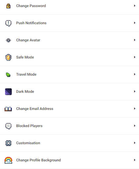
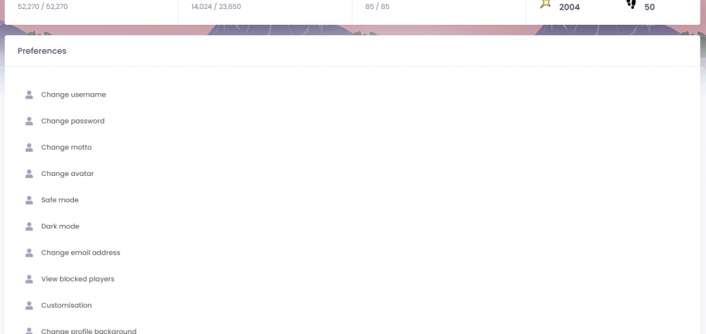
Every player, regardless if they have purchased membership, now has access to the brand-new SimpleMMO Web App.
After hundreds of hours in development and testing, this brand-new web app overhauls every single inch and crevice of the old web app. The development time for this project was long, hard, and incredibly time-consuming. In fact, this was the single biggest undertaking we have committed to since the creation of the game.
The Web App now is up-to-date with the Android app meaning all of the missing features on the old Web App are now accessible.
How will this Web App be different to the old one?
We will be treating the new Web App like a complete separate entity to the Android version of the game. This may mean that the new Web App will get features that are only accessible to the Web App. One of our mistakes that we made was treating both the Web App and the Android app in conjunction with each other which led to its many faults. Despite this decision, both the Web App and Android app will use the same semantic versioning as it has always used. This means that both the Android and the Web App will use the same version (example v9.4).
I don’t like change. Can I return back to the old one?
No, it has perished. Vanished. Gone. Thrown into space and set on fire. It was recently made obsolete and it is so out of date that it would be a very poor representation of what the game has become. Even though the new web app is still in beta testing, it performs much better than the old web app.
Will there be bugs?
Yes, there will be bugs. It is a beta after all and it is to be expected due to the nature of an overhaul. We have made a great effort in fixing a great number of bugs but some of them still linger. If you experience any bugs, please post them on the in-game discussion boards.
I have some suggestions on how to make it better. Where can I send them?
If you have any suggestions, feel free to post them on the “Suggestions” discussion board in-game. If you tag the title as [Web App] then you will get bonus points.
After a long, gruesome, battle with the game, the brand-new web app is finally available for pleb members! This is an early beta test so your experience may not be as smooth as you would normally expect.
Any player who has purchased plebeian membership can now enable the new Web App by doing the following:
Android App
Go to the settings page.
2. Scroll to the bottom of the page and press “Enable new web app”.
3. The web app should now be updated!
Old Web App
Go to the settings page.
2. Scroll down to the bottom of the page and press “Enable new web app”
3. The web app should now be updated!
Notes
This is a completely new and improved experience. The old web app was entirely scrapped. The entire thing was re-built from top to bottom. It was rubbish and it belonged in the bin!
Please do not expect a smooth experience while the beta is active. This is still a work in progress and there are still lots of bugs to be fixed.
You can return back to the old web app by performing the same action as you did to enable it.
The beta could last anywhere between 1 to 4 weeks.
Recently, you may have realised that there have been very little updates of great value on SimpleMMO. However, there is a good reason for that. At this moment, we are now focusing all of our efforts on building the brand new Web App. Everything in the existing Web App will be destroyed and rebuilt. When you get to play it, it will be like a completely new experience!
To keep you further in the loop, we are updating the SimpleMMO Public Roadmap whenever significant progress has been made.
If everything continues going well, we expect that the web app will be in the public testing phase by the end of June.
Before we get into our new rebrand, allow me to take you on a short journey. Let us spin the wheel of time back to July 2020. The sun is shining, the birds are singing, and SimpleMMO’s downloads have started to dwindle.
At that time, the conversion rate on the play store was extremely low. This means that most people were seeing the app on the Google Play Store, but they were not downloading it. These people could be potential players. My aim was to increase the conversion rate as high as I could get it.
In order to get SimpleMMO back on track, I decided to dive into split testing the Google Play store listing in order to optimise conversion rates to its fullest extent. If you don’t know what this is, basically Google offer a solution for developers to give multiple variants of an asset (app icon, app screenshots, etc) and it will tell you which one is more effective. For example, I could upload 3 variants of an app icon and, after a few weeks of testing, it will tell me which app icon was found to be the best at converting users. This is exactly what I did.
The current app icon (well… the old app icon) was created by myself using my slightly-below-average photoshop skills over around 2 hours.
It was simple, clean, colourful, and it fulfilled its purpose. However, there were lots of room for improvement. For starters, I am not a graphic designer. I tried my hand at that back in college and things just wouldn’t click for me. Secondly, while it certainly made parallels to the simplicity that the game provides, it is not something that attracted the eye.
My goal was to contact multiple graphic designers and have them whip up a new and improved app icon. Little did I know how truly difficult this would be to achieve.
Introducing the very first set of icons that ultimately ended up in the bin.
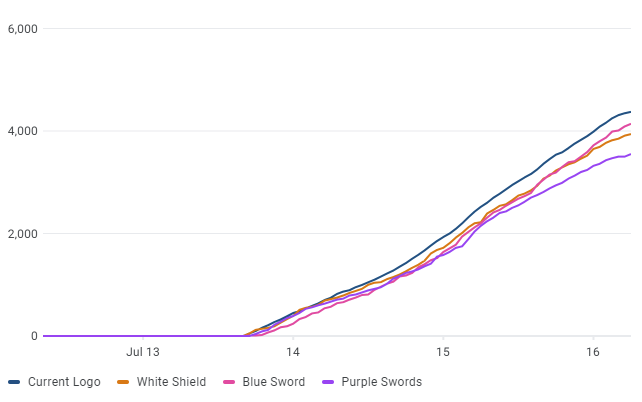
I thought these were pretty cool. I mean.. they have an awesome colour scheme, it shows the art style that the game utilises, and it gives the impression that it is, in fact, a game.
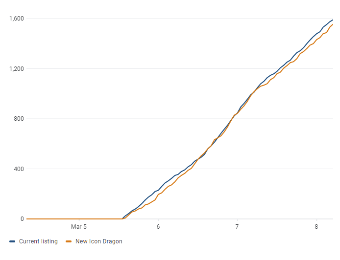
That is until I loaded them up into a split test.
The current icon beat them all… and quite significantly. The current icon was more than 30% effective than the worst performing icon and 10% more effective than the best.
“Huh”, I thought. “This is going to be way more difficult than I anticipated”.
Introducing the second icon that a graphic designer had spent god knows how long painting this masterpiece.
“Bloody hell, that looks fantastic”, I thought to myself. “We could be onto a real winner here”.
I couldn’t have been more wrong.
It completely bombed. It was around 25% worse than the current icon.
Maybe I was overthinking it and having the icon “over designed”. I think the simplicity of the icon is what drew people to the game in the first place.
This brought me to my third (and hopefully my last) attempt.
I believed this was the one that could finally beat the current icon.
I was wrong…again.
At this point, my hope for a new icon began to dwindle down the toilet. Perhaps, I am unknowingly the next Leonardo da Vinci and I have simply created a masterpiece among the likes which simply cannot be beaten.
At this point, I gave up.
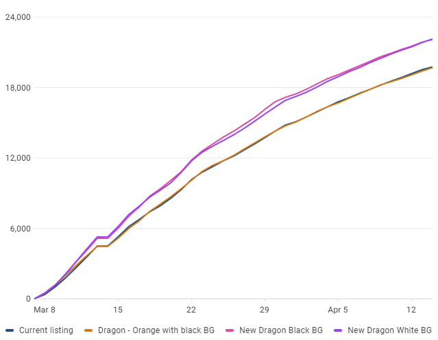
Until I came across a particular design I spotted while browsing on Envato.
“I wonder…”. I thought to myself… and alas, I ventured down the dreadful godforsaken path of split testing once again.
“Finally!”
I had finally broke the cycle of failure. This new icon was between 20 and 30% more effective. It was a real winner.
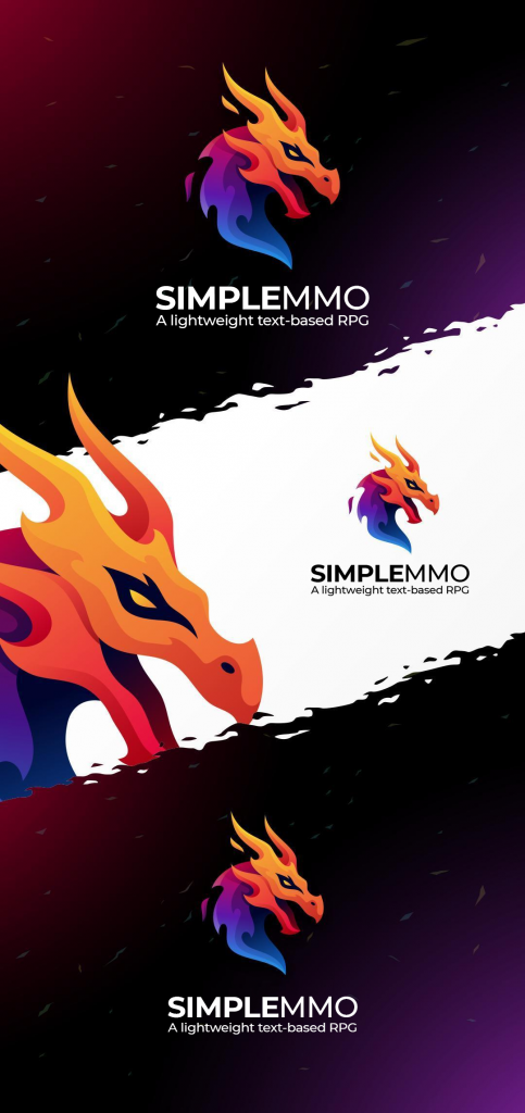
That’s when I decided to get in touch with the logo designer who created it. I sent him it over and told him “I want that! … but different”. After a week or so, he sent me the initial concept and it was perfect. It was exactly what I wanted. I finally had the perfect new icon.
So, after many many months of complete disappointment and thousands of wasted dollars, I would like to introduce to you the brand new logo and design of SimpleMMO.
Looks great, doesn’t it?
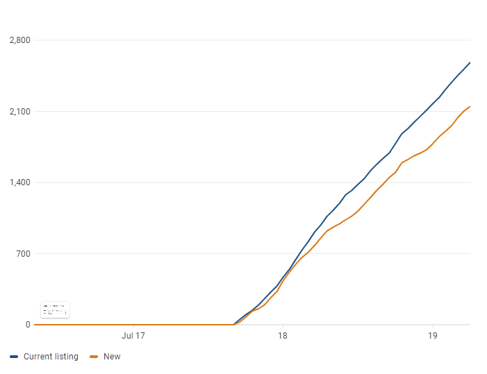
The app icon has shown to be between 20% and 30% more effective.
I thought I would do something a little bit different for this update. Rather than keeping the update under wraps until it is ready to be released, I have decided to blog the major changes that will be arrive with the next SimpleMMO update.
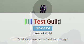
V9.0 heavily focuses on guilds. Guilds are a huge part of SimpleMMO. It is essentially the backbone of the games community and is important for us to recognise the importance of this. A well built guild mechanic can increase the interaction between the community, give the game more meaningful depth, and increase the competitiveness between players and groups. Because of this, I have worked tirelessly over the last few months overhauling the entire guild feature. The entire feature was essentially scrapped and re-written from the ground up. It was honestly a massive pain in the arse. My eyes are sore. My fingers are red and I swear last night I had a dream about being in a guild battle. It’s the most complicated area of SimpleMMO because the guilds module has its fingers dipped within almost every corner of the game. By doing this rewrite, I am able to expand upon the guild module and add more exciting features to it.
Let’s cover some of them that will appear in v9.0.
Guild Power
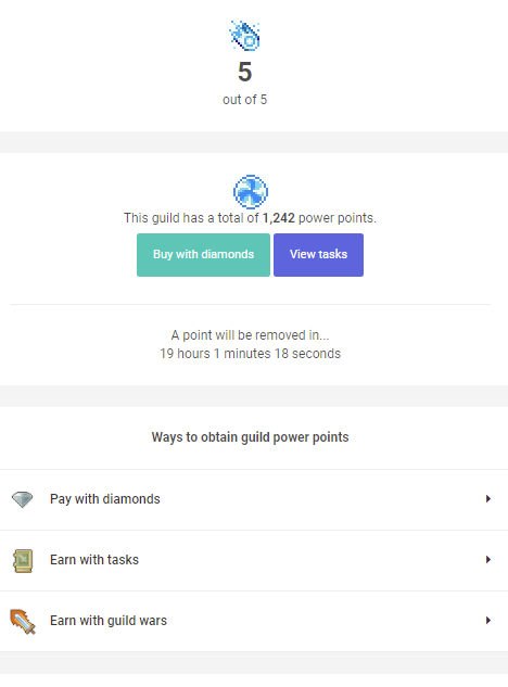
Introducing “Guild Power Level”. Guild power is a seperate type of guild level that was heavily inspired by Discords “boost” mechanism. This feature might be a bit complicated to wrap your head around at first but it is quite simple. I’ll try to break it down as simple as I can.
A guild has a power level of 1 to 5.
This power level is determined by how many Power Points the guild has. For example, a power level of 5 requires 60 power points.
A guild can have an infinite amount of power points but level 5 is the highest power level.
Each power level brings new bonuses to the guild such as increasing the member cap, additional armoury slots, and more.
Power points can be achieved from three ways: guild wars, completing guild tasks, and buying them outright with diamonds.
Every day, a guild loses a single power point. This is to ensure that the guild works hard to maintain or exceed their current power level.
Power Level*
Bonuses*
1
XXX amount of guild members +2% bonus exp and gold per travelling member 500 armoury items
2
XXX amount of guild members + 2.3% exp and gold bonus per travelling member 1,000 armoury items
3
XXX amount of guild members +2.5% exp and gold bonus per travelling member 5,000 armoury items Change guild icon
4
XXX amount of guild members +2.7% exp and gold bonus per travelling member 20,000 armoury items Change guild background
5
XXX amount of guild members +3% exp and gold bonus per travelling member 1,000,000 armoury items. Gradient guild tag Gradient guild name
All values are subject to change
Guild Levels and Experience
Guilds now have a level that is dependent on the amount of experience that it has. Levels are capped at 100.
All existing EXP will be reset on the new update. However, do not worry! The guilds current EXP will be archived and it will be listed within a “legacy hall of fame”. This hall of fame will be a leader board of the top 50 guilds with the highest EXP (before the reset). It will remain there forever without change so now there is an incentive to get as much EXP as possible.
Legacy guild EXP can be converted to “power points”. All guilds created before v9.0 will be eligible for free power points.
Gradient guild name and tag
As you may have noticed from the table above, you can now apply a gradient to both the guild name and the guild tag. This change requires a power level of 5. If the guild drops a level, then the guild will lose the gradient.
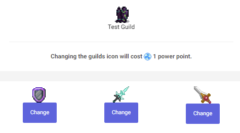
Change guild icon
A guild leader can now change the guilds icon to a sprite that they have within their collection. The guild needs to have at least a power level of 3 to do this. It will cost 1 power point to make a change.
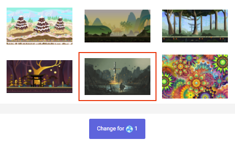
Change backgrounds
A guild leader can now change the guilds background to a background that they have within their collection. The guild needs to have at least a power level of 3 to do this. It will cost 1 power point to make a change.
Guild Activity
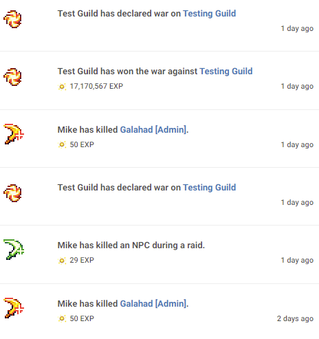
Woohoo! Finally! A much needed (and requested) feature. You can now view the activity feed to see how the members are contributing to the guild. You can also see how much EXP has been gained from a particular activity (such as PvP)
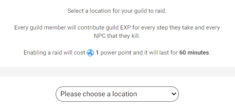
Location Raiding
A guild can choose to raid a particular location. When a raid has been activated, every NPC kill and step that a member takes will contribute to the guilds experience points. Raiding a location costs 1 power point and lasts for 60 minutes*.
Guild Only Leaderboards
This is basically the public leader boards but it has been filtered to only include the guild members. It’s quite handy if you want to see how other guilds members are performing.
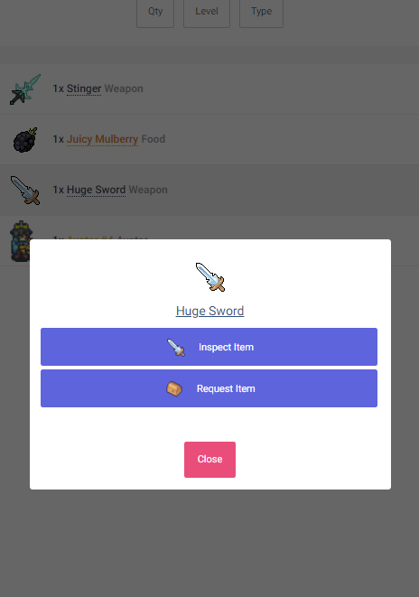
Guild Armoury
Players are now able to submit items to the guild armoury. Any member within the guild can the request any amount of items from the armoury and the guild leader can accept or reject the request. This feature is still a bit bare-bones at the moment, however I have plans to enable the ability for leaders to send items directly from the armoury.
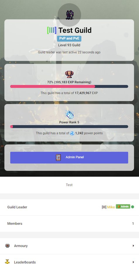
New guild design
Oh yes! Looks cool doesn’t it? I totally didn’t steal this design from the player profile page.
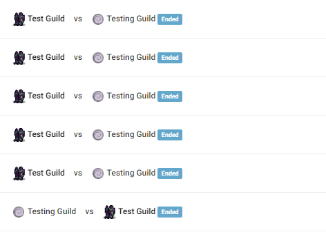
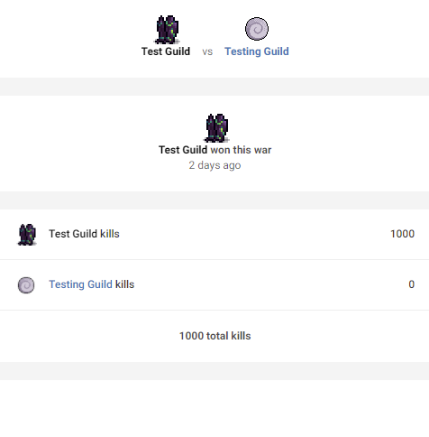
Guild wars
Guild wars finally have a meaning! Now, a guild can actually win a war rather than having it go on forever. The winner will get EXP and power points for their effort. The loser will lose EXP and power points just to make things interesting. The winner is the guild that reaches 1,000 kills first (or if a guild surrenders).
You are now able to inspect each guild war to get a break down on who is winning. This page is still fairly basic at the moment but I have plans to expand it in the future.
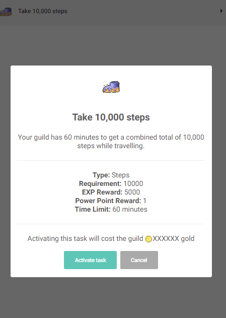
Guild tasks
Guild tasks work in a very similar way to your daily tasks. However, there are a few differences:
They need to be manually activated by the guild leader.
Activating a task costs XXX amount of gold.
If the guild fails at completing a task, then the guild will lose power points.
The guild leader can select from a list of many different types of tasks. From stepping, to PvP. Each task has a different requirement and also a different time limit. Some tasks may give you a long time to complete it but your reward will be low. Other tasks may require the guild to complete it within a short amount of time but the reward will be higher. It is up to the guild leader to determine what is the most suitable.
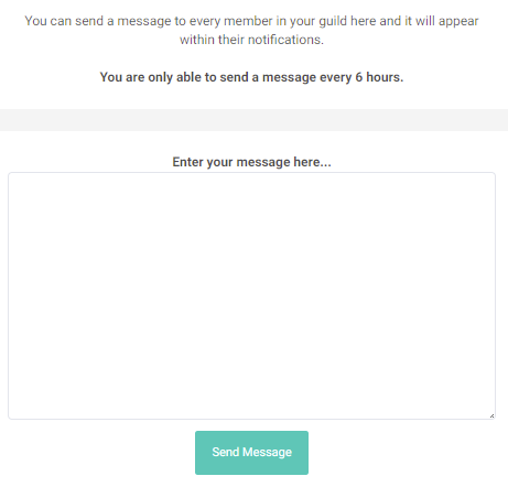
Mass messaging
The guild leader can send a mass message to all of the members. It’s quite handy if the leader is holding an event.
That’s all cool… but what else?
While I haven’t listed all of the new features within this update, the above definitely covers the grand majority. Guilds are something that I wish to expand upon even further but due to time constraints (and burn-out), I have decided to put the remaining features on hold.
Frequently asked questions (probably)
Still no guild roles? Why?
Read “That’s all cool… but what else?”.
Can you upload a custom icon to the guild?
No – not at the moment. However this may change in the future.
When will this be released?
v9.0 should be released towards the end of March once everything has been finalised.
* Disclaimer: All values listed both asterisked or otherwise are subject to change upon release.
Despite the name, SimpleMMO provides a lot of depth and the codebase that it is built upon is quite complex. It has been built for almost 3 and a half years now. This has given me an interesting idea for a blog post …
Let’s find how big SimpleMMO is
Let’s dive into the numbers…
There have been a total of 550,090 registered players on SimpleMMO.
Over 240,395,685 steps have been taken. That’s almost a quarter of a billion steps. Bloody hell! That’s approximately 205,349.5 KM assuming you are 180cm and walking briskly. The moon is 384,400 KM away. We’ve almost made it! Up yours doge coin!
Over 62,509,426 non-playable characters have given their life for the greater good. Those poor 1s and 0s.
4,487,929 players have been defeated in PvP. I’m sure the majority of them are from guild wars. The rest are most likely players who have reached level 100 and have suffered a fate worse than death. Those poor souls.
There have been a total number of 161,528,763 items that have hit peoples inventories. Crikey! 43,656,019 of them still remain in peoples inventories right now. It’s time for people to start clearing it soon because the inventory limit will be enforced shortly.
51,936,766 quests have been performed whether they were successful or not. That’s a lot of gigantic chickens that have been battled!
11,337,057 items have been sold on the in-game market. People love the market so much that some play the game solely as traders.
351,000 waves have been sent. That’s a lot of waving! I’m sure we could harness this wind energy somehow to power the servers. If anyone who is competent in the field of wind energy, let me know how we can achieve this!
There have been a total of 1,025 guilds created in the game. I think 100 of them have been created by myself for testing related reasons.
Over 5,757,187 chat messages have been sent in the global chat.
SimpleMMO has been played in 106 countries within the last 30 days. The top five countries are: United States, United Kingdom, Philippines, Canada, Russia
Over 6,932 players have suffered the wrath from Gren the Bitter because they failed to say hello to him!
256 suggestions have been accepted since the introduction of the suggestion system in the early months of 2020.
122 of those suggestions have actually made it into the game!
Over 1,227 players have been permanently banned for breaking the rules.
There are 13 moderators, and 12 advisers.
We have 1 full time developer working on SimpleMMO games codebase.
We have 1 person working on translating the game into Russian.
We have 1 contracted developer working on the SimpleMMO Android wrapper.
Now let’s dive into the technical stats
The entire database contains more than 134 tables. That is huge. It is most certainly the biggest database I have ever worked with! And I have worked with some huge systems in my past. Every table has a model, but not every mode has a table.
The game contains over 140 models. Think of models like assets in the game. A “guild” is a model. A “chat message” is a model. A “user” is a model. Even the small things like a “wave”. The next biggest system I have worked on only had ~40 models so the difference is huge.
We have made over 2,268 commits to the SimpleMMO master branch code base. This basically means we have made 2,268 updates to the game that have been finalised.
The game has served over 409,428,471 requests in the last month alone. That is almost half a billion requests in just 30 days. Crazy! We don’t have stats beyond 30 days.
We have served over 3.05 TB of data in the past 30 days. 1.67 TB of that was cached thanks to CloudFlare!
In the past 30 days, we have had a total of 141,987 unique visitors to SimpleMMO. Crazy! I never imagined it would ever get to that point.
SimpleMMO contains over 140,954 lines of code. This is lines of code that we have wrote ourselves (not including the framework). If you wanted to include the framework and all other packages that the game uses, then the total would come to 2,930,085 lines of code. However, it’s not really fair to count that one. To compare, Minecraft has around 280,000 lines of code if you run the command:
Back in August 2017, I was searching for a game to invest a little bit of my time in when I was not working. My requirements for this game were extremely simple. I wanted to play something that was extremely simple to use and required very little time or dedication. To put it plainly – it needed to be something that I would play while sitting on the toilet. That was my ultimate goal here.
My search for greatness
I started searching for this incredible game. Hours and hours later… I was still no further in my search. Every game I had come across was essentially the same. They were all massive, clunky fully-fledged RPGs/MMOs that seemed to be all reskins of each other. I think the closest I got to a game that I wanted was something called “RPG for destiny”, however it never interested me for two reasons; I have never played destiny, and I remember feeling rather overwhelmed at first when loading it up. It was rather raw in terms of UI.
I realised that simply such a game didn’t exist. They were either too clunky, or the UX was atrocious.
That’s when I got the idea of creating my own game. I wanted to create something that a player could just “pick up and go” within the matter of seconds. Minimal loading screens, no splash screens, unnecessary filler content, an extremely simple UI, etc. I wanted to make something that made the objective as clear as daylight. It had to be sleek, modern and attractive, yet self-explanatory and required very little in terms of a tutorial.
I know I’m in the minority here but I absolutely hate tutorials. I played “Call of Duty: Mobile” recently and the amount of hand-holding that the game gives you during your first few levels is completely abhorrent. In my eyes, it was the epitome of bad design. If a game requires that much hand-holding just to explain what the hell everything means, I lose interest almost immediately. In fact, as soon as I play a game that requires a mandatory hand-holding tutorial, I just immediately un-install it. I like to learn as I play. I like things to come naturally.
That’s when I got the idea of creating SimpleMMO… my “solution” to this gap in the market.
Well…. I say that as if I was making a strategic business decision to take advantage of said gap when in reality I just wanted something to play. In my head, I thought I would create something that I would play myself.
During this time, I was working a full-time job and I thought this was a perfect opportunity to improve my development skills on the weekend. While, at that point, I certainly dipped my toes in developing Android apps, this was on another level in terms of scope.
The dawn of SimpleMMO
On the 23rd August 2017, I sat down and began the development of SimpleMMO. I developed it using the “Laravel” framework. This was the very first time I had ever used Laravel.
I had an extremely bare-bones prototype ready within 8 hours. The code was atrocious. If I look back to what I had written, I would probably bring up last nights dinner. However, I did not know that then. After all, I only had 8 hours experience working with Laravel and, to be honest, I didn’t really care. I had absolutely no intention of growing this game beyond a hobby/side-project/playground. Honestly, it was garbage that was essentially held together with duct tape and glue. However, it was my garbage and I couldn’t have been more proud of it.
Fast forward a few months and I finally had a working game. I was ready to release this f̶r̶a̶n̶k̶e̶n̶s̶t̶e̶i̶n̶ beauty into the world. I quickly mocked up the Android wrapper using the source from FitIgniter and boom… SimpleMMO went live on 2nd February 2018.
My creation was available to the world.
At that point, SimpleMMO was really simple. Even simpler than it is now. It had essentially four bits of functionality to it: travelling, PvE, PvP and an inventory system. That was it.
Downloads were pretty solid. I got more than 100 within the first month. It was a really odd feeling seeing people play my game. I had essentially created something relatively enjoyable in my cave with a box of scraps.
I worked on it every weekend. Many new features were introduced to help give the game a little bit more depth. Friends, quests, messages, new items, player market, achievements, an updated travel page, and a bunch of other features that are still there today. A lot of these features suffered from short-sightedness and a lack of preparation for the future. The issues that are caused from said short-sightedness are certainly something that affects the game today. Problems such as a terrible inventory implementation, or the abuse of energy/quest-point refills were something I had never really considered at the time. Despite what people’s opinions on the game are, the “P2W” aspect was ultimately the result of said short-sightedness rather than it being a financial business strategy. This is a topic I wish to expand upon within another blog post.
Even though the game was live and accessible to anyone, it was still my playground. At that time, I didn’t really expect the game to become as popular as it is now. In-fact, I didn’t even dream of it.
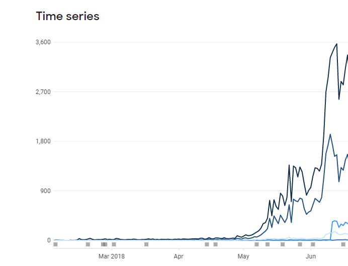
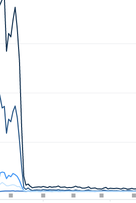
A few months go by then… boom. A massive spike in downloads happened. When I say massive, I really mean massive. Let me just whip out this graph from my “happy moments” stash.
At that point, I had breached 50,000 total downloads. I couldn’t believe it. Something I made was being played by thousands around the world. This was the point where I thought that this game could genuinely become something special. It had always been a bit of a passion project, but this made it seem like it could be something more.
… then disaster struck the game. Mr. Google decided to wake up one day and tell the board of directors, “I’m going to destroy this man’s whole career”.
The downloads literally plummeted overnight. It went from 3,000+ downloads per day, to less than 80.
To be honest, it didn’t really phase me that much. I completely expected it to happen. It’s not as if having 3,000+ daily organic downloads consecutively is normal especially for a small indie title.
From that moment, the downloads levelled off. It was around 80 downloads per day for around 2 years. However, since that moment, I realised the game had the potential to turn into something great.
The hole that keeps growing
Three years later and here we are. SimpleMMO has more than 500,000 downloads and it is continuously growing. The roadmap is public, the community is active, and the game is getting the love it deserves. I never thought it would be in this position, but here we are.
Not a bad debut blog post is it? I’m not much of a blogger. In fact, I’m not much of a writer in general. I almost failed English back in school. I was just lazy and more bothered about playing Call of Duty than studying. If you have played SimpleMMO, you know that typos are almost guaranteed. A wise man once said, “There are three things in life that are guaranteed: death, taxes, and typos in SimpleMMO”. That wise man was me.
I have a few topics that I want to cover in regards to SimpleMMO but I thought I would get this out of the way first. I thought it would make sense to cover how SimpleMMO came to be before I start to dive in further.