Before we get into our new rebrand, allow me to take you on a short journey. Let us spin the wheel of time back to July 2020. The sun is shining, the birds are singing, and SimpleMMO’s downloads have started to dwindle.
At that time, the conversion rate on the play store was extremely low. This means that most people were seeing the app on the Google Play Store, but they were not downloading it. These people could be potential players. My aim was to increase the conversion rate as high as I could get it.
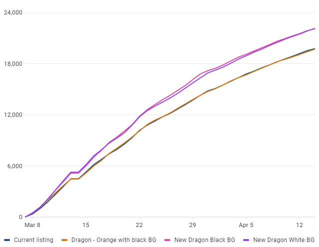
In order to get SimpleMMO back on track, I decided to dive into split testing the Google Play store listing in order to optimise conversion rates to its fullest extent. If you don’t know what this is, basically Google offer a solution for developers to give multiple variants of an asset (app icon, app screenshots, etc) and it will tell you which one is more effective. For example, I could upload 3 variants of an app icon and, after a few weeks of testing, it will tell me which app icon was found to be the best at converting users. This is exactly what I did.
The current app icon (well… the old app icon) was created by myself using my slightly-below-average photoshop skills over around 2 hours.
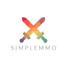
It was simple, clean, colourful, and it fulfilled its purpose. However, there were lots of room for improvement. For starters, I am not a graphic designer. I tried my hand at that back in college and things just wouldn’t click for me. Secondly, while it certainly made parallels to the simplicity that the game provides, it is not something that attracted the eye.
My goal was to contact multiple graphic designers and have them whip up a new and improved app icon. Little did I know how truly difficult this would be to achieve.
Introducing the very first set of icons that ultimately ended up in the bin.

I thought these were pretty cool. I mean.. they have an awesome colour scheme, it shows the art style that the game utilises, and it gives the impression that it is, in fact, a game.
That is until I loaded them up into a split test.
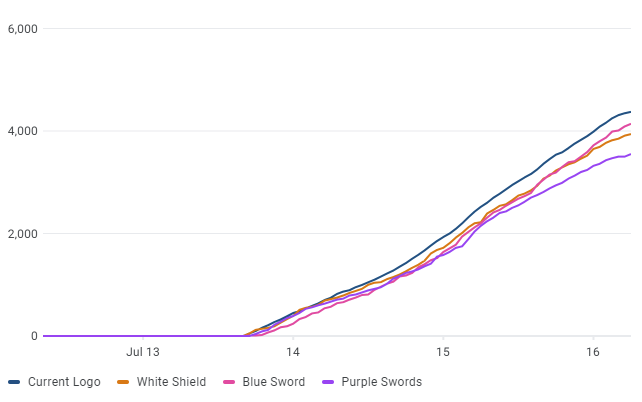
The current icon beat them all… and quite significantly. The current icon was more than 30% effective than the worst performing icon and 10% more effective than the best.
“Huh”, I thought. “This is going to be way more difficult than I anticipated”.
Introducing the second icon that a graphic designer had spent god knows how long painting this masterpiece.
“Bloody hell, that looks fantastic”, I thought to myself. “We could be onto a real winner here”.
I couldn’t have been more wrong.
It completely bombed. It was around 25% worse than the current icon.
Maybe I was overthinking it and having the icon “over designed”. I think the simplicity of the icon is what drew people to the game in the first place.
This brought me to my third (and hopefully my last) attempt.

I believed this was the one that could finally beat the current icon.
I was wrong…again.
At this point, my hope for a new icon began to dwindle down the toilet. Perhaps, I am unknowingly the next Leonardo da Vinci and I have simply created a masterpiece among the likes which simply cannot be beaten.
At this point, I gave up.
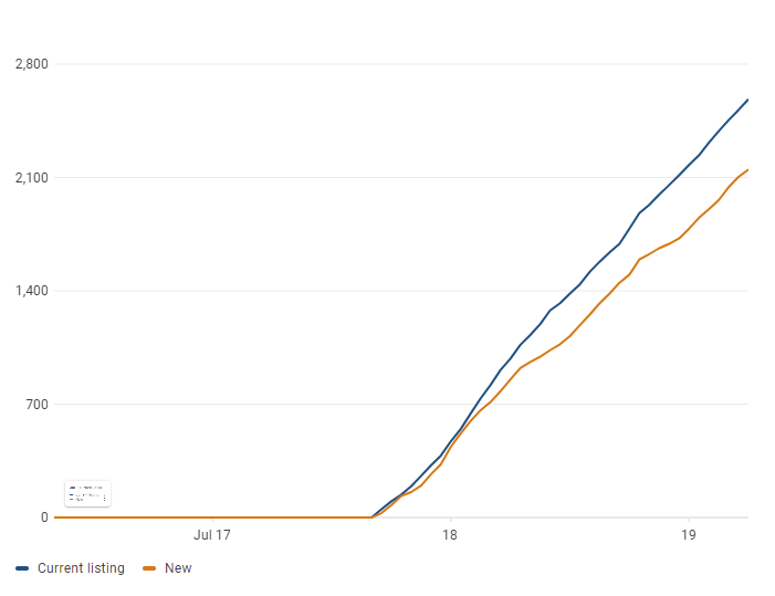
Until I came across a particular design I spotted while browsing on Envato.
“I wonder…”. I thought to myself… and alas, I ventured down the dreadful godforsaken path of split testing once again.
“Finally!”
I had finally broke the cycle of failure. This new icon was between 20 and 30% more effective. It was a real winner.
That’s when I decided to get in touch with the logo designer who created it. I sent him it over and told him “I want that! … but different”. After a week or so, he sent me the initial concept and it was perfect. It was exactly what I wanted. I finally had the perfect new icon.
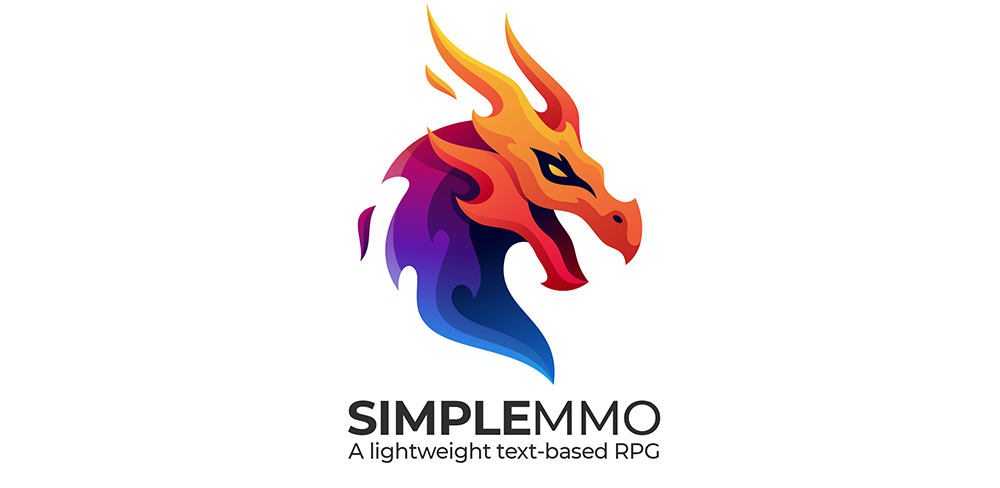
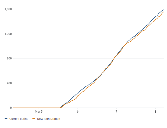
So, after many many months of complete disappointment and thousands of wasted dollars, I would like to introduce to you the brand new logo and design of SimpleMMO.
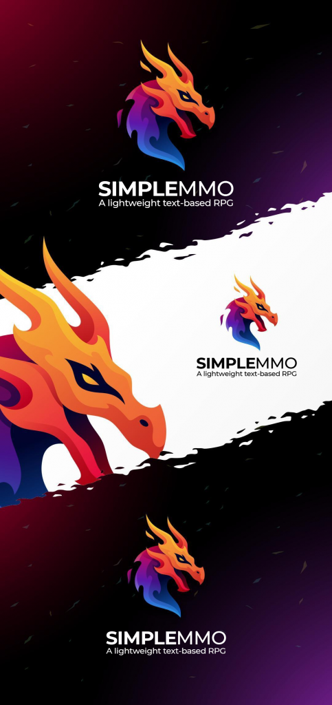
Looks great, doesn’t it?
The app icon has shown to be between 20% and 30% more effective.

My frustrating journey finally came to an end.
Looks great!
Looks great mike, I love it.
Hi Mike, that’s a very nice logo. I would like to make another suggestion regarding World Bosses. When the World Boss battle starts, it starts with all its normal stats. But once it’s hp% starts dropping below 90%, it’s attack becomes (attack/ % of hp remaining) and defence becomes (defence* % of hp remaining). Also if possible, if a player is below wb dex, then player takes additional damage. The damage will be (attack from above formula*(wb dex/player dex).
Beautiful Logo 👌
icon looks great, I wonder where the dragon is in the game though
POGGERS
Poggers, love it.
Niceee!
Lovely! Seems the long road was worth it after all.
Good looking icon, great work!
Ah, the pains of market testing! Ultimately your “simple” game is a community and an addictive stress reliever. Thanks for giving us a home and for the wicked new logo!
Mozilla SMMO
As soon as I noticed the logo on the main screen my FIRST THOUGHT was “Oh wow that looks slick I wonder where that came from.” I specifically try to stay away from update info and blogs. I’m very busy as is. I’m glad I saw this post shared in a server. I’m so happy to have a creator who not only cares about making improvements but who also is GOOD at it. I will miss the old swords if you do eventually replace the download icon. It’s what pulled me in all those months ago. The change is welcomed in my book!
❤
The old icon will disappear forever in the next update.
We Should see a Dragon Boss endgame; makes sense considering this awesome logo!!