We are thrilled to announce the exciting rebrand of SimpleMMO!
It wasn’t that long ago since we recently moved away from the sword logo to the dragon logo. In fact, we went into detail on the reasoning behind the rebrand and ultimately it boiled down to it being the most effective in pulling in new players.
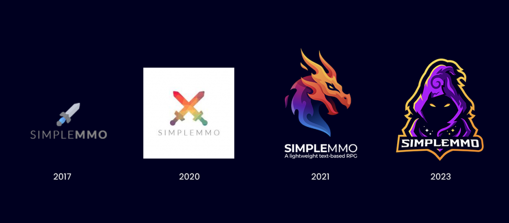
As time went by, we slowly started to lose our love for the dragon logo due to two big reasons:
- The colour scheme presented significant challenges in our work process. The combination of blue, purple, orange, and red, along with small black elements, proved to be quite problematic when attempting to establish a cohesive and unified brand for the game. Despite the promotional images using a darker background, it was originally designed with the intention of placement on a white background. We’ve recently made a company-wide decision to shift our focus towards creating products solely using a dark colour scheme and, in our opinion, the logo doesn’t blend as effectively against darker backgrounds.
- The dragon and the text lack unity, existing as two completely separate elements, with the dragon positioned on top and the text beneath. While this design approach might suit other businesses or software, we realised it wasn’t quite fitting for a game. Our aim was to create a logo that exudes a more unified and game-like appeal.
During our pursuit of designing a new logo, our initial step involved creating a fresh app icon, which would serve as the foundation for the subsequent logo design.
The process for deciding on our new icon lasted approximately 6 months utilising the same tools provided by Google as we done during our previous rebranding. The tools allowed us to see if a logo was effective at bringing in new downloads to the game. As the app icon has a huge prominence in a store listing, being the first element users encounter on the Google Play page, it stands as one of the most critical factors in driving new downloads.
We went through various different types of icons testing the effectiveness of them against our dragon icon. During this period, we leveraged both traditional icons and icons created by artificial intelligence (AI) to explore its potential in creating an icon that could be even more effective than our dragon design.
Here are just some of the icons we tested throughout the time period:
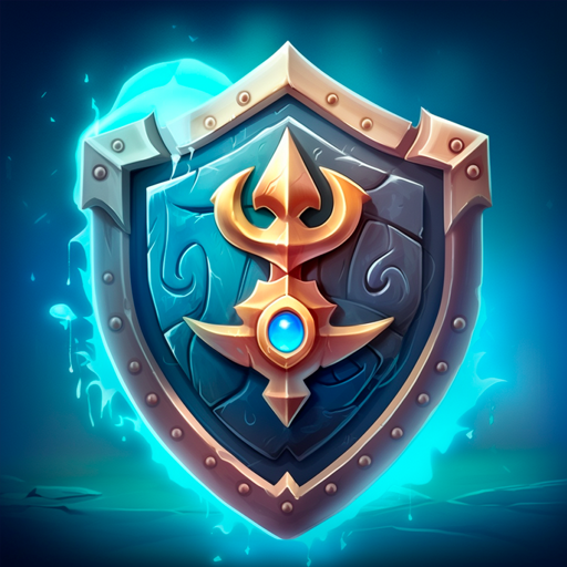
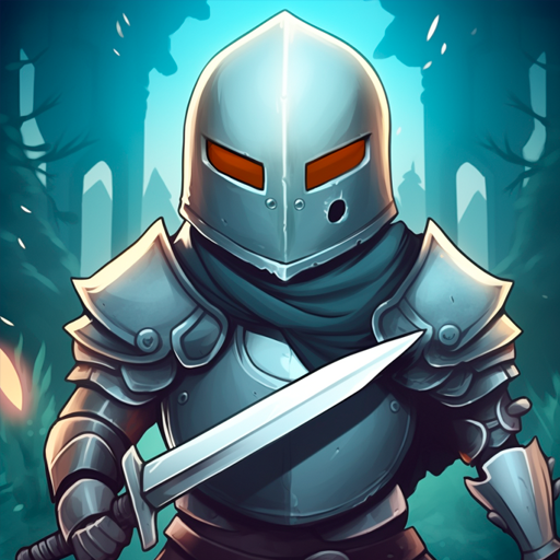
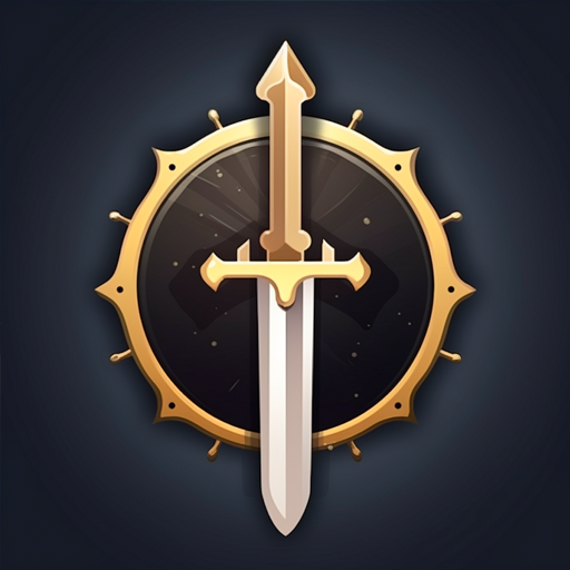
Despite these icons, a critical problem remained unresolved: they failed to address the issues we had with the dragon icon, leaving us apprehensive about the possibility of yet another rebrand in the future, repeating the same cycle of uncertainty.
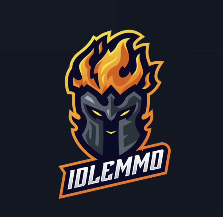
Throughout this period, we also dedicated our efforts to developing our second game, IdleMMO, and we are delighted that its logo addressed all the concerns we had with SimpleMMO’s dragon logo. The newly purchased logo boasts a cohesive design and an established colour scheme, perfectly aligning with our vision for the game.
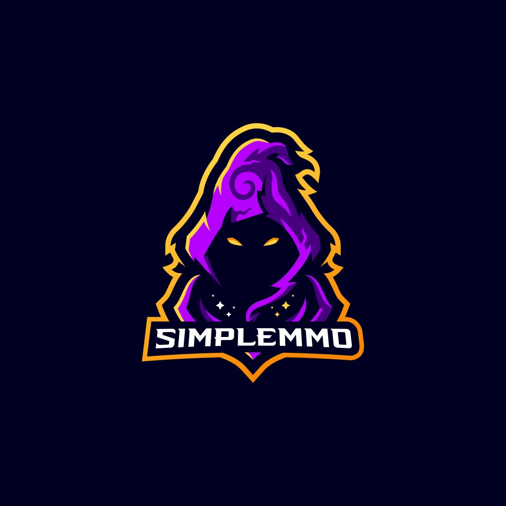
So, naturally, we decided to use the same artist for SimpleMMO.
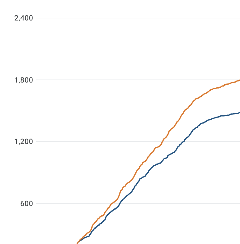
The results were overwhelmingly positive, as it was determined with 90% confidence that the new logo could potentially yield a remarkable 25% to 40% increase in engagement.
And it was definitely evident…
It is perfect and, as a result, we decided to completely change our brand to this new design.
The rebrand will be gradually introduced over the next few weeks, and we are absolutely thrilled with the response we’ve received so far. We firmly believe that this new logo perfectly aligns with the direction SimpleMMO is heading towards.
Can’t wait for the second game
Looks great! I will miss the dragon though haha!
Your app is amazing👍😍🤩
I’m pretty sure that you’ve put more research and work into a logo than I’ve put into my entire career. That said….. I will miss the dragon.
do we have an updated release date for IdleMMO?
Nope. Not yet. Keep an eye on our Discord!
The new logo looks like something you will see from an ESports team so I cant say I like it. Why not try a pixel art logo instead? It’s the art style most prevalent in the game after all, I personally check out games with pixel art as their logo on the playstore more and have longer playtime.
We tested pixel art style logos and they don’t perform well at all.
I will always remember the dragon, thats the icon that was used when I first began playing, but this rebranded logo looks amazing and im looking forward to all the new faces we will see in game soon !
Yikes. Yet another rebrand… Always with the same type of post “This one does so much better!!?!!!”
I mean… yeah…
The alternative is to just make no post at all I suppose.
Oh well, I guess I’m just biased being a pixel artist lmao
It will be odd getting used to the new branding but I’m happy to see the effort that is being put in to the game to keep it fresh and alive
Very excited for the new game as well, keep it up
This game used to have so much potential, right down the drain. i can see why the rebrand revenue must be down and then to recreate the same game says a lot. best of luck! hopefully you choose the right staff this time around.
Rebrand revenue? Same game?
So, you are rebranding to avoid taxes or something? Kinda suspicious 🤨
Miss you Mike ♥️
The logo’s pretty fire/
I agree.pixelate it.lke the game. That’s always bothered me,when pixelated games have a completely different art style …I dunno just sayin
Don’t mind the bots and the idiots. This logo is FIRE, and although the dragon was amazing, I agree that it’s not perfect. It would be nice to keep it as legacy. Also, the game is great I guess. I can confirm that it works, because I immediately went to check the blog post. Great job!